It is our third major release since 2011. And our second release done in-house. It has been an interesting couple of weeks and thought I’d share a few insights.
To be honest, we had been postponing the upgrade for a few months now as client work and new product features took priority. Finally, we managed to sneak in a couple of weeks to design the new look and put in the development needed to give it life. Needless to say, the design went through a number of revisions in a matter of few days before we zeroed in on a particular theme.
As an overall strategy, we wanted to put more emphasis on our products and hence the completely revamped home screen. We wanted the new site to be bigger and bolder than our previous two versions. We also wanted simple descriptions (inspired by Apple) and hence the breakdown of our product descriptions into digestible short versus. We didn’t want to clutter the site with too many screenshots of our products but just enough to give a glimpse of our work to our readers.
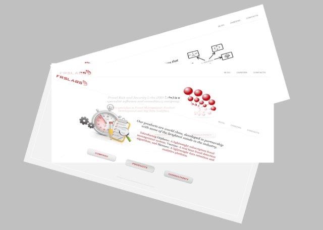
If you had seen our earlier versions, there was company, products and consultancy as the three pillars of the home page. In the new version, we let the three products, Orpheus, Visitor+ and Referrals+, take centre stage. The design is also practical as we can add more contents, products or features with ease.
In the previous version, we had adopted a standard typography. In the beta version, we had five different typographies to differentiate different sections of the website. However, after testing, we realized that the fonts were taking too long to download and hence slowing down the whole experience. We had to fix it and eventually settled for two simple yet widely used fonts.
I guess the biggest challenge for the team as any web developer would vouch for was to ensure that the website worked seamlessly across multiple devices, screen sizes and browsers (and different versions of the same browser). After a few hiccups, a few late nights, several lines of coding and recoding the team managed to get it just right that would hopefully work across devices and browsers.
Well. That’s it and hope you like our new site. We certainly enjoyed creating it. In case you are wondering how our old site looked, here’ one for the history books.


